Rebrand and Website Redesign
Action Canada
Rebranding an Organization That is Fostering the Leaders of Tomorrow
%20B.jpg)
Action Canada runs a competitive fellowship program for young leaders working at the intersection of policy, advocacy, and social change. When they came to us, the brand didn't reflect who they were or who they were trying to reach.
The existing identity — red and blue palette, all-caps typography, maple leaf mark — positioned them closer to a government department than the independent, youth-facing fellowship program they actually are. A competitive audit confirmed the gap. Peer organizations in the same space had built confident, contemporary identities that attracted applicants on sight. Action Canada's did not.
The core challenge was a genuine design problem: build something authoritative enough to command credibility with policy institutions, while energetic enough to recruit emerging leaders under 35 — without reading as partisan, stiff, or governmental.
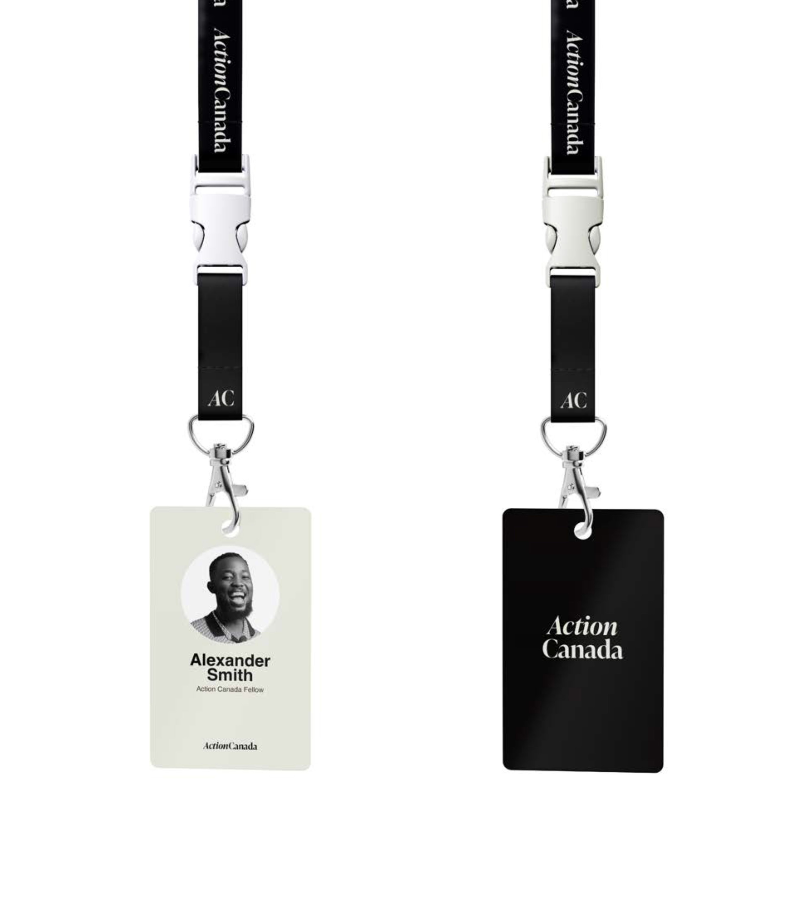
We started with research. A competitive landscape audit, stakeholder interviews, and a full UX and accessibility review of the existing website gave us a clear picture before we touched a single letterform. Three decisions defined the rebrand. The maple leaf was removed — the word "Canada" already carries national identity, and the symbol was reinforcing exactly the reading the brand needed to escape. The wordmark shifted from all-caps grotesque to a mixed-case serif, chosen for its ability to read as both friendly and authoritative. And "Action" was italicized — introducing forward momentum into the letterform itself.
The result is a brand system and digital platform that finally matches the ambition of the organization and the people it attracts. One fellow put it simply: the new identity was something to be proud of — a far cry from the dated, static feel of the old branding. This is what fellowship, advocacy, and policy work looks like when the design is doing its job.